|
|
| Search | Car Forums | Gallery | Articles | Helper | Air Dried Fresh Beef Dog Food | IgorSushko.com | Corporate |
|
|||||||
| Sketching and Drawing Sketchers and drawers in the house? |
 |
 Show Printable Version | Show Printable Version |  Subscribe to this Thread
|
|
|
Thread Tools |
|
#1
 04-15-2009, 05:40 PM
|
||||
|
||||
|
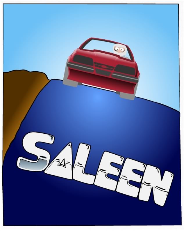
Auto Poster--Art Deco style...
Working on a modern, but very toony version, of a design based on 1935 Delahaye auto poster.
Crossing Art Deco style background with 60's style toon lettering and my current style of toon drawing. Might work or end up banished from the web.... ...have to wait and see. 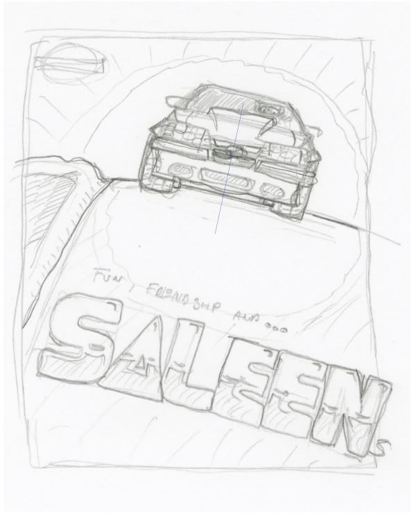 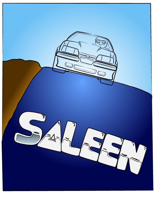

|
|
#3
04-16-2009, 11:21 AM
|
|||
|
|||
|
Re: Auto Poster--Art Deco style...
Hey Blip, looks good so far. When you get the rest of the text on it, it will change the looks of the whole thing. I'm watching with interest to see how it comes out.
gbritnell
|
|
#4
04-16-2009, 02:42 PM
|
||||
|
||||
|
Re: Auto Poster--Art Deco style...
Thanks, and just finished the letters. Still got a bit more to do on the Mustang.
Doing a "paint-like" style for the car is making me go slower as a try creating without line. Tire tread is next. 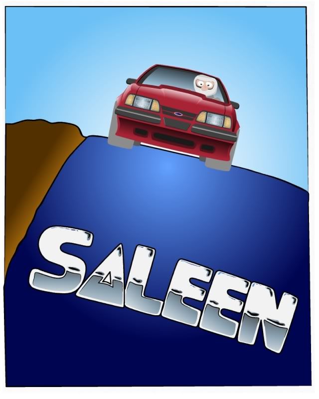
|
|
#6
04-17-2009, 03:02 AM
|
|||
|
|||
|
Re: Auto Poster--Art Deco style...
the chrome "SALEEN" competes with the entire image for attention
do something to fix that is your drawing about the chrome letters or the car? right now the car is rendered well, and the SALEEN logo is a cheap afterthought. Also the quality of the rendering of the chrome f/x is inferior to the quality of the rendering of the car. It doesn't match. also the yellow type is not only unreadable, but doesn't match further the design. to create a true Art Deco homage, study the typefaces of that era on poster graphics and you will see that they are very elegant, not cartoony and chromed.
__________________
[links removed by moderator]
|
|
#7
04-17-2009, 05:33 AM
|
||||
|
||||
|
Re: Auto Poster--Art Deco style...
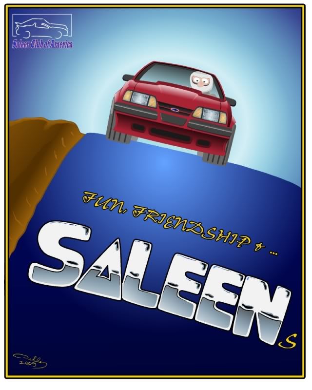
Interesting to hear that the fonts aren't working. The Chromy font idea came from a favorite Ed Roth image, (probably really done by Ed Newton or Robt. Williams).
May have mislead as I wasn't trying for a true Art Deco look, just with the car image. So it appears that the different styles of font vs. image don't work for you. The original poster used a very simple handmade font that looks close to the modern "Impact." Might try a version of that, to see how it looks. Thanks for the comments, Bonz, good to have you posting again.
|
|
#8
04-17-2009, 12:17 PM
|
|||
|
|||
|
Re: Auto Poster--Art Deco style...
Quote:

__________________
[links removed by moderator]
|
|
#9
04-17-2009, 03:00 PM
|
||||
|
||||
|
Re: Auto Poster--Art Deco style...
This version is very true to the original poster design with clean looking
simple block-like lettering. Even the artist signature was in yellow and located the same as mine. Not sure this is a style that works for me, but it was interesting attempt at being pushed out of my comfort zone.  Struggled a bit to give the lettering a hand painted look with vector shapes. (Don't think this is my last go at this one.) 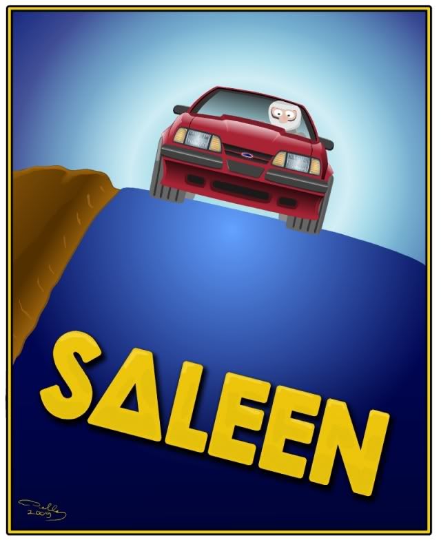
|
|
#10
04-17-2009, 03:06 PM
|
|||
|
|||
|
Re: Auto Poster--Art Deco style...
very nice!
went from tacky to tasteful instantly. the first version looks amateurish, the second version looks nearing professional. typefaces/fonts make all the difference.
__________________
[links removed by moderator]
|
|
#13
04-18-2009, 10:50 AM
|
||||
|
||||
|
Re: Auto Poster--Art Deco style...
Keep in mind I know nothing but--my eye goes to the dirt and the pencil stroke like ditch lines--they are very evenly spaced and not painterly like the rest --also and I don't know if this is the intention but there is lots of space not being used--kinda floaty.
Just thoughts --but that car IS beautiful!
|
|
#14
04-26-2009, 08:42 PM
|
||||
|
||||
|
Re: Auto Poster--Art Deco style...
i cant believe this slipped by me. the stang looks freakin real. Wow Blip!
|
|
#15
04-28-2009, 02:48 AM
|
||||
|
||||
|
Re: Auto Poster--Art Deco style...
GB-thanks, this one pushed me a bit on how I think about making a design.
Patty--Yup, I went with the easy way out on doing the background and didn't follow a bit of guidance I got a while ago to put as much effort into background as you do to the main subject. On the compostion, it's a mimic of the original poster with the placement and open space. Liked how it looked so stay with that concept.
|
|
|
POST REPLY TO THIS THREAD |
 |
|
|