|
|
| Search | Car Forums | Gallery | Articles | Helper | Air Dried Fresh Beef Dog Food | IgorSushko.com | Corporate |
|
|||||||
| Sketching and Drawing Sketchers and drawers in the house? |
 |
 Show Printable Version | Show Printable Version |  Subscribe to this Thread
|
|
|
Thread Tools |
|
#1
 07-02-2008, 10:51 AM
|
||||
|
||||
|
Event Logo Design
Did up a quick design for a Saleen club event.
Here's the pencil rough... 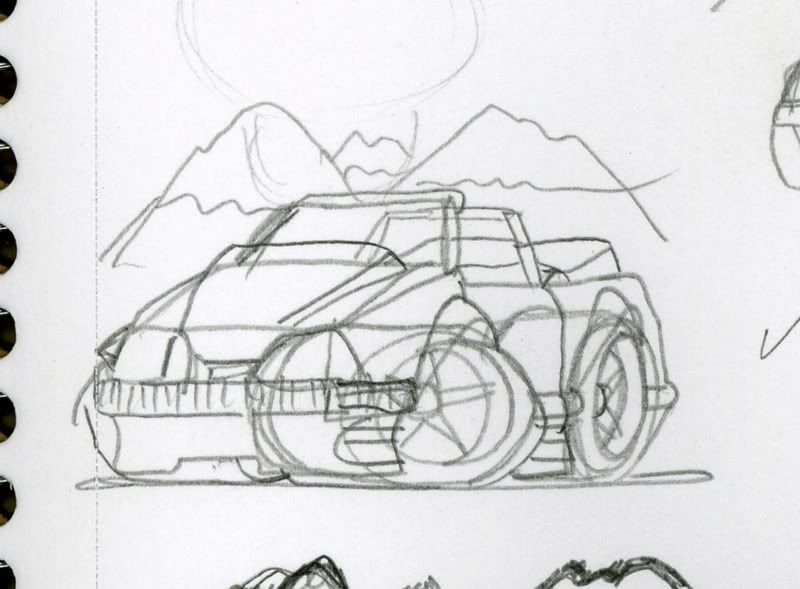 And what I sent to the event chairman, waiting to hear on any changes. (Thinking about making the flag wave a bit instead of being so stiff--it was a qucik add-on and I was gettin' tired of this design.) 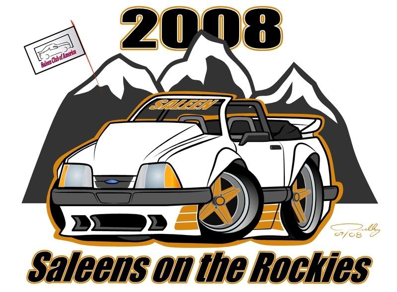

|
|
#2
07-02-2008, 02:42 PM
|
||||
|
||||
|
Re: Event Logo Design
looking good! theres nothing wrong with it, just looks a little too squashed for my taste.
__________________
I'm the kind of guy who appreciates a fine body regardless of the make.
|
|
#3
07-02-2008, 05:14 PM
|
||||
|
||||
|
Re: Event Logo Design
nice, i see your lines are getting bigger , hehe !
|
|
#6
07-02-2008, 10:10 PM
|
||||
|
||||
|
Re: Event Logo Design
Thanks for the comments.
Yep, I did go with a bold (bigger) outline as this was for a logo image and I wanted the shapes to standout no matter what they use as a background color. (Figured you might spot that Cartoonerz.) Whelp, I have been working at drawing Mustang toons the way some of you all draw Bugs, but I still need much practice. Many times it seems that the pencil thumbnail has a better shape/flow than the finished vector image. If I could just capture look that in the final work.
|
|
|
POST REPLY TO THIS THREAD |
 |
|
|