Quote:
|
Originally Posted by Hiroboy
I have mixed up a small sample (15ml) of the colour using my paint manufactures formula and it looks wrong, any ideas ?
|
First of all, I REALLY respect what you are doing here, Steve.
It's "above and beyond" and I want you to know that I appreciate it.
Secondly I agree, it does look "wrong"

It looks too "greeny" to me but goddam I
am officially classified as red/green color blind

I tried comparing the percentages of your formula and the standox formula Ramon provided:
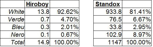
But I don't think it really helps. Firstly they are for sure different base colors and the only major difference is in the content of black/white and in fact your formula calls for less green!
So, what's up?
Scenario 1: The Renaissance reference is strange. Perhaps, but I am pretty sure that this is the color they put on the model on their web page. I don;t see Etienne saying one thing and doing another.
Scenario 2: Pastelturkis means different things to different manufacturers. Very probable.
Scenario 3: the color you have mixed behaves completely differently under clear coat and turns more light blue. Possible I guess. Base coats
do change under clear...what do you think?
what to do? As you know, I
really want to use your paint so I suggest the following:
a) switch the blue/green proportions in your current mix at my risk
in addition either:
b) if you have a color in your swatch book that YOU think is closer please add it and I will purchase that
or
c) If you can mix to Pantone numbers please make a batch of Pantone 293 (this is the blue in the BMW logo) and I will purchase this also.
How about that? does it work for you?